Monday, 5 September 2016

Summer Project

For our summer project, we were asked to make a cyborg character, starting from concept art to a final 3D render. The character must be at least 20% mechanical and 20% flesh. The low poly model can't be anymore than 15,000 triangles.

We have to:
  • set the narrative and character 
  • produce thumbnail sketches, a final concept illustration and a model sheet
  • create a low res character model 
  • make a high res shell around the model
  • transfer maps and textures
  • final render 

Setting


The Glorious Kingdom of Nuorbis, whose arms reached most of the Earth, rose to power after The Collapse, a combination of nuclear wars and a string of natural disasters that had devastated the planet and eradicated almost 85% of the human population. A few northern countries merged together and reinstated an absolute monarchy in the hopes of herding the remaining people and the Earth away from the brink of extinction. Technology was heavily invested in to aid repopulation and maximise productivity, leading to the development of functioning androids and cybernetic organisms – humans who had lost functions restored to them through this technology. Androids and humans have lived side by side for centuries. With androids taking up laborious and mundane jobs, humans have more time for scientific advances and artistic pleasures.

Recently, however, there have been reports of androids achieving sentience all over the world. A small group of rebels have appeared, demanding the rights and lifestyles of humans, threatening the balance and stability of Nuorbis.

You are a knight of the Queensguard. With a global civil war brewing, you have been asked to support the controlling Queen in quelling the storm as a spy – but will you? As a cyborg, you have been put in a peculiar position; part human, part machine, how can you raise your hand against your kin? Do you rally for your Queen, betray your friends to join the rebellion, or seek for a peaceful solution that will benefit everyone? You ask yourself if that is even possible, before making your decision… 

***

I immediately had some ideas of what I wanted the game and character to be about; it would be stealth, sci-fi game, where the character's cyborg status would be the catalyst for the conflict. This is where the idea of humans vs androids came from, a common trope. I also knew I wanted the game to have multiple routes which would have multiple endings and story elements exclusive to each route. So, the game would allow players to choose a side, or to remain neutral and it would mess with the player's sense of morality.

Sci-fi is not that interesting to me, so I found it difficult to come up with a convincing setting at first.  Instead, I thought about how I could add in elements of things I do like to make it easier to work with. I recently became inspired by King Louis XIV's reign of France in the 1700s. He enforced an absolute monarchy, so everything he said was law. This made it very difficult for anyone to object or protest, as it would be considered treason. I thought that if androids really existed and became sentient, many humans would rally with them for equal rights, especially as societies become more and more open minded as time goes on. For the conflict like that of a civil war, it would have to be quite divided and there would have to be a solid reason why most humans would be against the androids. A closed minded community would be ideal for this, so I wondered if I could create a setting like the 1700s but with technology. In the end, I thought of a world where a monarch like Louis XIV needed to be in charge and tried to relate that to the rise of androids. 

The name "Nuorbis" came from Latin; "nuvo" for new and "orbis" for world. I researched how countries got their names and they are often named after people or things that the land reminded the founder of in their native languages. Nuorbis is supposed to be some European countries merged together, like England, France and Spain. The languages from these countries are Latin based so that's why I chose to create a name from Latin. "New world" seemed appropriate and is often associated with a utopian ideal. 

The reason I wanted the character's cyborgism to be a point of conflict is because it reminded me of the inner conflict of being of mixed ethnicity. My dad is Jamaican and my mum is Irish and I have often struggled with my identity, with people often asking me which side I prefer. I wanted to reflect this part of myself in my character while also making her struggle relevant to the story line.

I also did some research into events that almost led to human extinction and decided on a combination of natural disasters and war as the reason for The Collapse. I wanted to play on the current global warming issue, as well as rising tensions between countries at the moment which people are worried will start another war. I called it "The Collapse" because big events in history have always had dramatic names, like the Black Plague and the Great Depression. 

[to be updated]


Monday, 14 March 2016

Speed Study: Whale Boy (and brush techniques)

In this class assignment, we looked further at building the illusion of form using light and shadow. After, we did another speed painting study. 

We looked at how you can achieve form using a low pressure soft round brush, keeping the opacity very low. We were given a black blob to paint on top of to give the impression of form. This is what I came up with. 


I really like the outcome of this. I feel that most areas of the blob now look like a different kind of 3D shape, with a clear light source. I struggled a bit with the bottom area, because I didn't want any light hitting it directly but I still wanted it to have form. Although you can tell there's some form, I feel like it could be better. 

Next, we were given a small blurry version of an illustration by Bobby Chiu and had to do a study based on that. The idea was to get in all the important information, such as the values, hues and shapes, and not worry too much about the tiny details. Here is what I came up with after 30 minutes.


Next, we were given a higher res version to then add some details. I'm satisfied that I've got a solid foundation so I move on. I tried to make the silhouette more accurate and added some detail on the face. Not wanting to spend too much time in one spot (like I learnt from the speed painting of the old lady we did some weeks ago) I moved onto the whale eye and tried to define this area more. Next, I added the red into the seam on the head of the whale and also the little holes on the head. I kept on refining as much as I could in the time frame and this is what I got after a total of 2 hours.


Bobby Chiu is a fantastic digital artist and he uses many colours in his work that at first glance may appear to be just one. His work has a lot of brush strokes. I found it difficult to pick out all the colours, especially in the face. I tried my best and am happy with the result, but if I had more time I would have liked to get the colours more accurate. Still, I learnt that adding little faint details, that might look messy and sketchy, over time will accumulate into a much more detailed painting. Also, all the whites I used (apart from the teeth) were picked from the lightest part of the sky I painted. I tried it out and realised that I did not even need to use pure white or a lighter version of the base colour, I could use a light blue, which was also in the centre of the painting, as the whites and I found that this brings the painting together. If I had used a light pink, for example, on the boy's mouth where he is dribbling, or a light green for the sea foam, I don't think the painting would look as unified.

Monday, 29 February 2016

Composition: Desert Scene

We watched a video about understanding composition. We learnt that good composition consists of balance, structure and a focal element. 

After that, we were given an image of a house in a desert and were asked to create a new rough speed painting based off this image, changing its composition using the rule of thirds. 

I started with the background, then added the middle ground (which is the foreground in the original image) on a separate layer. 


Then I added in the background on another layer.


Finally, I added in a cactus (bottom right) on the opposite side of the house (top left) using the rule of thirds. I decided the cactus would be my focal point in the foreground. I then started to paint over all of this and refine the image.

Here is what I ended up with.


This painting did not end up as well as my previous speed paints in terms of how detailed it is, which I feel is due to me not being used to rendering scenes and backgrounds. Also, it was my first time trying to create parts of an image while speed painting, so I took more time to think than if I was purely copying a full painting. The composition is quite nice but I think it would be better if I made the house a bit higher up. I used the rule of thirds and put the house right in the middle of that top left cross section. The cactus I added in the foreground, however, is lower down on its respective cross section. Also, the flowers on the cactus should be different. Next time I do a speed paint of my own I will pay extra attention to the colours to make sure every colour suits the overall image.

I chose the cactus as the focal point but now I see that it is a bit boring. It would be good if I had added something happening near the cactus, such as a bird or butterfly interacting with the flowers.

Sunday, 28 February 2016

Battle Arena

Battle Arena

Our first project for 3D Art Production is to create a battle arena. We were asked to create a mood board to show what we would like our arenas to look like. 


I grew up playing fighting games so I took inspiration from my favourite ones. The above images are from various Tekken games, Soul Caliber 4, Super Smash Bros and Playstation Allstars: Battle Royale. I like the way that Tekken and Soul Caliber arenas are usually an enclosed 3D space in the shape of a circle that the players can move all around. Sometimes players can be pushed off the edge, like in the third image down on the left (PA: BA) and the bottom right image (SSB), which is something I wanted to keep in mind for my own arena. I want it to be quite stylised as opposed to realistic, with bright saturated colours and I also want the arena to be outside. One of my favourite things about stages in fighting games is that there are usually some animation sequences going on in the background that make everything more interesting and life-like; I would like to incorporate that into my arena somehow.


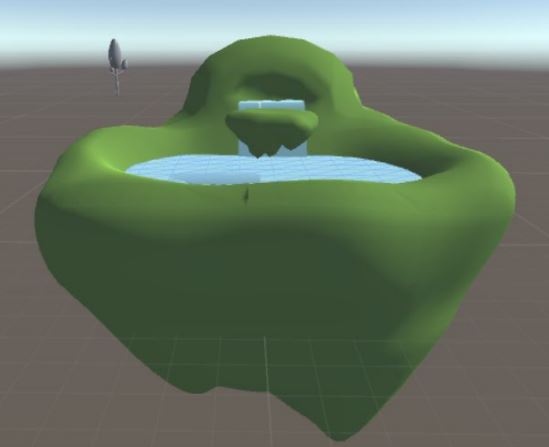
I made some thumbnail sketches for a floating island concept. I liked the first one on the left but decided it would be more interesting to add another level to the arena like on the right. Phil told us to make a list of all the things we would need to model. It is going to look something like a garden so there are basic environment things like trees and rocks but I thought it would add something extra to it to put some sheep in. I want to try and add a simple animation to them, maybe walking around or just moving their heads up and down. I will try and do this if I have the time and can figure it out. I really want to include a small pool of water and a waterfall, as well as having the island above clouds.

Here were some of my first attempts at the island:


I really didn't like the look of these islands. Although, I realised that they were impractical after placing a 3D character controller in the scene in Unity. I tried something else.


Equally as bad. Maybe for a different type of level these would be okay, if done better, but for a battle arena I thought it didn't work.

At the same time I played around with some trees and bushes.


I was going for that low poly effect that can be seen in a lot of indie games lately, so I still like these models, but they didn't feel right to me. I kept on and eventually came up with these.


The scene has been lit with ambient light just so that I could work with the models whilst thinking of cartoon-like styles. I like these models much better and I am really pleased with them. Each tree and bush is a variation on the last to save me some time. I altered them enough so that they don't look identical but look like the same type of tree or brush. I added some spheres and other shapes that I made myself onto the bushes to look like flowers for some extra variation.

I went on to model some other props for the arena.


The gate was added to reinforce the garden/countryside theme.


I started making some swords. My idea was that this was the kind of battle field that is quite peaceful but is littered with remains of past battles. I wanted to do more, like shields, axes and arrows, but I did not leave myself enough time. I had a lot of fun making these, even though they are variations of each other. It was my first time experimenting with making objects other than plants, so I was quite excited with the results.

Here is my final arena and all the props, one with ambient lighting, because I really loved this look, and one without, which better fits the brief. I placed the props in Maya before exporting to Unity.


I added in some rocks too. Keeping in line with my work pattern so far, I made three variations, with two different colours for more depth to the scene. I am really pleased with this. However, the topology for the island is terrible. I made it this way because I struggled visualising the island, but once I had gotten it to look the way I wanted, I could not figure out how to fix the topology without disturbing the shape.

I learnt so much about 3D and about myself whilst making this arena. I have not been very good at 3D, being a really slow learner to it. A lot of this is to do with attendance. Once I discovered low poly models, though, I really started to enjoy it and ended up making something I'm very proud of, even with its mistakes. I'd like to get better at it over the summer, particularly topology issues. I am still unsure how to fix problems when they arise.

Character Statue

For my statue, I wanted to create a godess of war. Here is my moodboard:


I wanted to combine different types of goddess imagery and thought about multiple limbs. However I decided very quickly that it would be best to stick to a normal human female body for my first time modelling one. 

Here's a quick concept image that I put together. 


After this I got to work on the model. I wanted the whole project to look cartoon-like, so I decided to draw my own front and side references for the body. This, I later found out, was a bit of a mistake. I spent a long time on this and in the end my drawings did not translate well into 3D, at least at my current level. So I scrapped it and make another model based on photos of a real woman. 


Here is the better model that I ended up with.


Here is the final version.


I had used nCloth on the skirt originally but unfortunately it kept messing up, so in the end I when back to the more simple version.


You can see in my files that I added some textures to the statue. I got a stone texture online and painted over it so that it didn't look too realistic. I wasn't able to add textures to the rest of the scene because I was confused as to how to add them into the scene when I first did the statue. In the end, I figured it out, but I have no textures for the rest of it now. This is my fault, if I had gone in more I either would have known or could have asked.

Overall I am pleased with the result but if I had managed my time better I would have done a lot more.

Hand


Sculpting Rocks

Following another tutorial, I made a rock. I started off with a cube and used the sculpting tools for the first time to mould it into a rock. This is what I first came up with using just the sculpt and smooth tools.


I was really pleased with the result and enjoyed the process. Then I experimented with the other tools under the sculpting tab to create something a bit different.


I liked the relax tool a lot better than the smooth tool because the relax tool does not change the shape of the object. The foamy tool was good for making the rock look like a broken part of a bigger rock, the pinch tool was good for sharpening edges, the flatten tool was good for the bottom of the rock and the build up good for making the rock bigger whilst keeping the overall shape.

Barrel


In our first 3D Art Production class we followed a tutorial by Phil to create a barrel. I struggled at first, having to redo the barrel 3 times. I had never modelled anything before so it was quite difficult to get used to it. By the third attempt I got much better and faster and came up with a barrel that I liked. 


We then tried to add a texture to the barrel. I found this difficult as well and was unable to attach the texture to the barrel itself. Below is how far I got. 


Now that I am a bit more familiar with modelling and texturing I would like to redo this from start to finish when I have the time.