Monday, 19 October 2015

Lava Character

In this assignment, we were asked to create a lava creature using the painting techniques learned from the class session. 

I knew I wanted the character to be humanoid and thought of a type of siren that lives in pools of lava. This type of siren attempts to stop people from running away when a volcano erupts. I looked up references of dreadlocks because I thought they resembled the way hardened lava sometimes looks, like in the second image below. 


Along with hardened lava, I collected some images of molten lava as well as a couple of representations by other artists. 

Here are my initial sketches.


These were very quick because I had a clear concept in mind already - I wanted to show her habitat, so naturally I'd want to draw her in a pool of lava. After a couple of scribbles trying to think about how she might be mostly submerged as if she were bathing, I came up with a little drawing of her just standing. I thought this would make a more interesting illustration, especially because she is a siren and her looking dead at the viewer would add to that feel. I also played around with a few different hairstyles before settling on the middle one - long dreadlocks left out. 

I scanned in this page and traced over the sketch, blocking out some shapes and values. 


Next I defined a light source (the pool of lava). 


Once I had a rough idea of what kind of lighting the light course would make, I started to create the rocky skin often found on lava characters and also golem characters. It resembles cracked, hardened lava. This was by far the most fun part because I was surprised at being able to do this despite never having rendered rocks before.


Here I used a layer with styles effects added - inner glow, outer glow and colour overlay. We learnt how to do this in the last class. My version was pretty close to the one that Steve gave us, but I just tweaked the settings a little bit. 


I created a layer on top of this to add extra yellow details on the lava in the cracks of her skin and hair. I also added a yellow layer set to overlay at 10%, to unify the image, and also lightly painted some yellow onto her legs as the colour from the lava would reflect onto her grey skin.


Here is the final image, which I cropped because I felt the composition looked better this way.


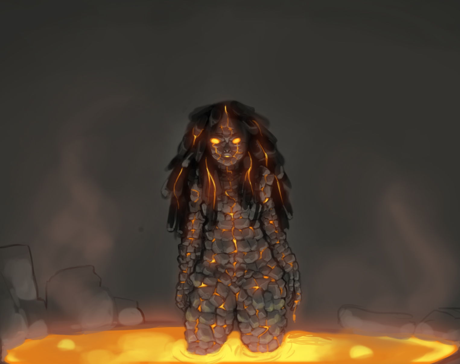
Upon reflection, I feel that her pose could be more dynamic, even though she is only standing up. Rendering the rocks was very time consuming, so next time I would look into a quicker way of doing it. Also, there is nothing in the background which takes away a little bit from the overall impact of the illustration. Other than that though I am very happy with this piece and feel quite confident at rendering lava now.

Lava Painting Techniques

In this class we were to practice techniques for painting lava. Below are my first attempts at directly painting lava with a standard brush, using yellow, orange and dark reds. This is not bad for a first attempt but the colours look quite muddy and overall it's not very convincing. 


We learnt about styles in Photoshop and how to create our own. Then we were given the image below and were asked to paint lava onto the creature using what we had learnt. 


I used the magnet lasso tool as instructed to cut out the creature and added a dark background.


Next I went around the edges with a soft round eraser to integrate it more and also edited the levels and curves. 


Then, using a variation of the style Steve gave us, I started to paint on some lava.


Finally, I took a yellow brush on a new layer and tried to make the lava stand out a little bit more, as the thinner lines only came out orange on the styles layer.


Although I am happy with the image, I think it looks much better smaller. If I could redo this, I would pay more attention to the thinner lines and make sure they aren't scratchy. When working on my lava character next, I'll make sure to keep that in mind and use what I learnt here.

Monday, 12 October 2015

Pixel Art

In this assignment, we had to design a retro toy and draw it in an isometric pixel art style. I decided to do a robot toy as was recommended, due to the simple shapes and bright designs. 

Here are the reference images I used. 


Here are my initial sketches. 


I picked my favourite three and turned them into silhouettes to see which design was best. I went for the first one because it was my favourite one from the sketch stage. Also, I felt like the 3rd one would be too hard to do in the style on my first try, and the 2nd one was too common a design. 

I made three different colour concepts. The first one was based on the iconic robot design (top row, middle image in my moodboard above), so I decided against that one due to it being already done. I picked the pink design because I could imagine it more on shelves than the bright green one, especially as it is more gendered and toys were more gendered in the 40s and 50s, when these robot toys were most popular.
Using the tutorial, this is what I ended up with, at it's original size, at a bigger size and also integrated into the image provided. 


I think it blends in quite well with the picture, partly because I directly colour picked the colours from the scene after noticing that all yellows were exactly the same (except for the cheese which is lighter). Unfortunately, the design had to be changed while I was drawing it in the isometric pixel style. I found triangles and circles/spheres to be very hard to work with, so I changed the head and torso to cubes. I also changed the feet to yellow as I felt like the initial design had too much pink. Also, the image is a little too big. We were asked to have it at 128x128px but mine is 150x200px. This made it difficult to integrate into the scene because I needed to resize it, but whenever I tried to make the robot smaller the quality was lost. I got around it by sizing up the robot 200% and the scene 300%; this made the robot appear to be around the same height as the other toys in the scene so I was happy with this in the end. Next time, I will keep the canvas size at the required pixels from the start.

Monday, 5 October 2015

Futuristic Weapon

For this assignment, we had to come up with a futuristic weapon.

I am not very good at weapons, so I thought hard about this one and tried to be creative. I thought of what kind of future would this weapon have been born from. Usually, new inventions are made to combat current problems. At the time of writing, there has been a lot in the news about young black boys in America being shot often by the police there. I also read a lot about it happening to those suffering from mental health during a breakdown. I thought, what could be made to change the way these police interact with the public? I also don't like the fact that dogs are used in service to police and military.

That's when I came up with P.A.W.S.


Are you a police officer? P.A.W.S. is your new best friend. The Police Apprehensive Weapon System combines the tracking capabilities of a police dog and the stop power of a taser. There is no need for guns anymore! Simply input the suspect's data and let your P.A.W.S. friend track them down. No data? No problem! P.A.W.S. is constantly scanning and updating its own database. The suspect will be caught in no time. P.A.W.S opens up and emits a green light that engulfs the suspect and restricts their movements. Its cute appearance is very non threatening and will keep the public at ease while the suspect is being caught. While there IS a destroy function, it can only be used if authorised by the highest of higher ups for very dangerous operations.

***

I really like this idea but I did not leave myself enough time to turn it into a full illustration. I learnt to use my head and get creative in situations where I feel out of my depth. 

Body Proportions, Elves and Dwarves

We looked at body proportions and how you can measure them by heads. For example, the average male is around 7 and a half heads tall. Putting this into a fantasy context, we looked at two body types on opposite ends of the scale; elves and dwarves. We were asked to design an elf and a dwarf keeping in mind that elves are usually around 9 or 10 heads tall, whereas dwarves are normally around 4 heads short. 

Here are my initial sketches of the elf.


Elves are commonly portrayed with pale skin, living in forests from lands based on European countries. I wanted to explore what an elf might look like from a rainforest in a tropical island instead. The first sketch is slender but I wanted her body type to reflect that of someone from the Caribbean; wider hips, fuller lips and strong legs. 

Next I played around with some values and hues. 


I was ready to move forward but I realised that I had not made the elf at least 9 heads tall; she is about 7 heads tall. I decided to start with a new drawing of her rather than painting over the one I already had done. At the same time, I thought it would be a good idea to work on the dwarf this way too. I wanted them to look like they came from the same place, living amongst each other in the same city. So I came up with the dwarf's design as I went along, trying to make it compliment that of the elf.

I blocked in some silhouettes first and figured out the contrast and values, then I started to paint over this in greys, blacks and whites. 


On a new multiply layer I added the colours. 


Then I colourised the values layer using Image > Adjustments >Hue/Saturation and also changed the levels so that they were brighter. This allowed the colours to show through more.


Once I was happy with that, I started painting over it all in colour. This is what I ended up with.


I really enjoyed creating these characters, particularly the elf. I struggled at first with the proportions; I am used to drawing women around 6 heads tall. The ovals in the middle really helped, especially with the dwarf, which I found the harder one to do. The dwarf's waist should be a little bit lower.