We were asked to draw a sci fi room in 2 point perspective, using references from sci fi movies and TV as inspiration.

Above are some stills and set images from some recent futuristic sci fi movies. I used recent ones because a lot of the technology in old sci fi media is now real in some form, so I wanted to use current depictions of what the future might look like as inspiration. I also used a picture from The Jetsons cartoon. I like how vibrant it is and would like to incorporate that into my design, even though the look of the cartoon itself is very dated.
Here is my initial sketch:

We needed to include a desk, a chair, instrument panels and a doorway. I wanted to explore what a sci fi themed bedroom/living space might look like and due to the room needing instrument panels and a workspace, I decided to combine home living with work. I imagined what a future "cubicle" at a desk job might look like; employees literally live at their desk. There is a bed in the corner up against the window, a desk with a panel incorporated into it and another panel opposite it connected to the wall. There are many screens around; the ones around the desk are for work and the ones on the windows display messages such as "Good morning!", the time, weather and other status updates. The plant in the corner is synthetic. The screens and panels will have a holographic quality to them. The door is the kind that opens upwards automatically, so there is no door handle. The room is very cramped so I want to keep the colour scheme very simplistic and bright, as I feel like this would be implemented to keep the employees "happy".
I really like circles and contrasting them with sharp edges, however I found that circles are very hard to render in perspective, so I changed everything to squares.
Here is my progress.

First I used the reference image provided to get some accurate perspective.


Once I had the base for my room, I started adding in the objects and values.

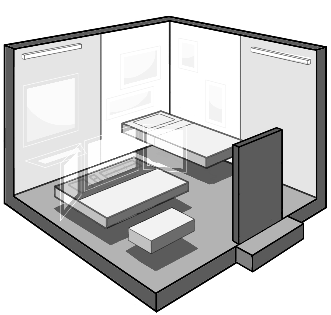
Here is my final image.

As well as the shapes, I changed the plants a bit.
I found this assignment very laborious as I mostly used the pen tool to get my straight lines. I think I will get better at this with practice. I also found the perspective tricky in the beginning to figure out. I thought the horizon line was in the middle of the image, but this made the perspective wonky and it wouldn't line up. Then I re-read the file given to us for this assignment and saw an example of 2 point perspective with the horizon line above the image. I decided to try this and it worked! I definitely need to do some more perspective studies. Overall, I feel more confident designing interiors, which is not something I am very good at.
No comments:
Post a Comment